


How It Started,
How It’s Going: Mortal Kombucha
In the third installment of his series, “How it Started, How its Going,” Andy Kurtts, Founder and Creative Director at Buttermilk Creative discusses the the Mortal Kombucha packaging evolution with Founder and CEO, Becca Schepps.
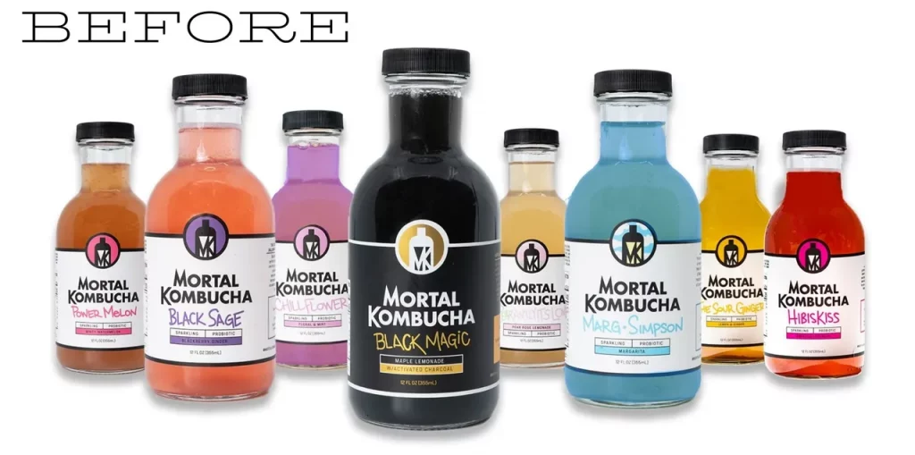
Based in Boulder, copywriter and creative director Becca Schepps came up with the idea for Mortal Kombucha in 2017 when she was working on a packaging design for a new dessert that wanted to say ‘good for you’ but wasn’t that good for you. Holding a kombucha in her hand, she was looking to see how they worded ‘good for you’ and saw the ingredients ended in “100% love.” Upon seeing those words something clicked and she felt there was an opportunity to develop an aggressive kombucha brand that had nothing to do with love. She came up with the name right then and there: Mortal Kombucha (a pun on Mortal Kombat, the notoriously violent video game). She initially launched in jest without an actual product but when people started buying from her website she got to work and launched her brand in earnest. In April 2020 Becca redesigned her packaging and relaunched the brand.
Andy Kurtts: What prompted you to re-design your packaging?
Becca Schepps: For pricing reasons we made changes to the bottle shape. The new bottle was also used by several category leaders. This made me very scared – so the thought was, if we’re gonna go into the same exact bottle and sit next to these big brands on the shelf, we better look drastically different. It would either work, or fail.
AK: What were your goals for the redesign?
BS: Well we knew we needed to standout on the shelf if we wanted to have any success. While we didn’t want to alienate female kombucha drinkers who traditionally are the largest target customer we also wanted to attract new kombucha drinkers with our reimagined look. Our goal was to create something that could exist in a yoga studio and a boxing gym. Plus we just wanted to have fun in the category. That was a major driver.
AK: What inspired the look behind your current packaging design?
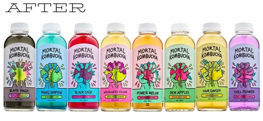
BS: I love vintage Gwen Stefani, circa Tragic Kingdom. Also Santa Cruz skateboards and peak 90s brands like Roxy, Quicksilver, and Stussy sprinkled with a little Lisa Frank nostalgia. Think late 80s/ early 90s brands when fluorescent was the rage. Loud and proud. We wanted the look to be fun and playful with an edge. Plus, I love the aesthetic of hand drawn, but not messy.
AK: How did your messaging on the packaging change with the redesign?
BS: Our messaging actually remained exactly the same, even the back copy. By trade I’m traditionally a copywriter – so I wrote all the original copy. However I also designed our old bottle – which I’m NOT a designer. So while the words on the bottle always conveyed the brand I was trying to create, the visuals did not. Now with the redesign it is just conveyed much more colorfully with better hierarchy.
AK: How has this packaging redesign changed your overall brand messaging and image?
BS: Because the new look is so much more fun we’ve really leaned into bringing it to life on social media and our website. We have beefed up the attitude and personality. Personified our flavors and given them attitudes (and body parts at times). We continue to work towards bringing our look and feel to more aspects of our brand off the packaging in terms of where we show up and how we show up. It’s all about making sure we can be this “alt” kombucha.
AK: How has your packaging redesign impacted sales? What about customer reach? Wholesale accounts?
BS: We launched the new packaging in April of 2020 and in Q4 2020 sales were up 20% YOY as compared to our old labels. Now in 2021 as new packaging has been out a year we are up even more. Every month seems to be our best month. We have received great feedback from buyers who are excited about how different we are. One large chain buyer called and told me that he had reviewed 250 kombuchas and ours was the only one that stood out. We made a lot of changes in 2020, and while they all contributed to our amazing growth – I truly believe the label redesign opened the doors and the team and product’s integrity sealed the deal.
AK: What was your biggest take away from redesigning packaging?
BS: The risk was worth it. When we locked in on doing this design I thought – ‘welp we are either gonna blow up in a good way or blow the brand up in a tragic way.’ We had to choose between safe or dangerous with the redesign and we chose dangerous. It was a delicate dance between standing out and fitting in so we didn’t alienate the existing consumers. To do this we followed things like color trends, but were careful to stay away from design trends that everyone was mimicking.
AK: What was the biggest lesson you learned from the redesign?
BS: Go all in and don’t look back. We were playing it too safe early on. The brand from idea inception was about creating a true wild child rebel brand and to be honest, we are still working on dialing that even more.
AK: What was the biggest surprise from this process?
BS: The response from buyers – we didn’t know how it was going to be received. A buyer had a bunch of samples at her house and she told me that her kid, who never drinks kombucha, loved it. Our broker teams love the imagery of the redesign and it helps the product resonate with people who otherwise would not drink kombucha. I think it makes people thing – hmmm what’s this, maybe i’ll try it.
AK: Tell me about what ended up being your favorite part of the process.
BS: I love innovating. I love coming up with ideas. I love having a vision and pulling in the pieces to make it come to life. It was super exciting to create this brief of everything in my brain, hand it to the design team and see what came back — and how they’d interpret my musings. Usually I’m the one that gets the brief, so it was great to see concepts evolve and grow and play client. This redesign played a huge role in building and creating the brand exactly how I want it to be.
AK: What would you consider to be the most challenging part of the process?
BS: The biggest challenge wasn’t the design part. I think coming from that world I knew what to expect and was able to give the design team all the tools they needed for success. That means having all your assets (logos, upcs, nutrition panels, ingredient lists, flavor names, certification icons), label mandatories (net weight, disclaimers, fda regulations) and anything else important easily accessible and organized for the design team. Give them the box to work in, but also be open to looking outside the box if all the mandatories are met. Timeline wise – everything always will take longer than you think, so I knew we had a hard deadline that we had a production run coming up, so I wanted to have everything printed 1 month before that, knowing that sometimes things creep longer.
Actually the biggest back and forth I had with the designers was color. I think the designer was going to kill me. I kept pushing him in one direction and he really wanted to go a different way. I had him do the color I wanted and then the first time we printed labels I realized I was wrong and had to go back to them, dragging my tail between my legs and ask him to change the colors, because he was right. That said, I think its important to pick a lane and proceed, otherwise you can seesaw on a decision forever and delay things. It’s like yes, it should be perfect, but you can always iterate on perfect.
AK: What advice would you give to other business owners considering a redesign?
BS: Before you jump in on packaging design figure out who you are on a brand. Don’t just go with the trend. You package is all you have to tell your story when you’re on a shelf. Once you figure it out, lean into it 100%. Also trust your designers!

All Comments